
My Favorite Web Design Trends for 2023
It’s no secret that a lot of coaching businesses and service providers struggled in 2022; many went back to working 9-5 jobs for someone else. And while we know the success rates for small businesses are, well, dismal, they’re even worse during a recession.
When people are spending more on life’s basics, that means your brand is gonna have to work harder to get (and keep) the attention of potential clients.
That’s why this year is the perfect time to invest in your branding.
This is the year you have to master your marketing with a brand that stands out and a laser focused message in order to thrive.
So here are my top 10 favorite design trends for the upcoming year and how you can implement them on your own site.
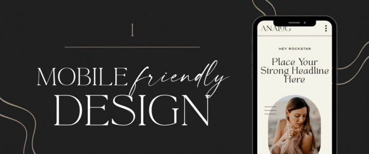
Listen, you should already be doing this but in case you aren’t, this is your friendly reminder.
Why?
Because mobile searches overtook desktop searches way back in 2015 and mobile traffic accounts for nearly half of all web traffic worldwide.
Not only that, it’s good for SEO. Google has been ranking mobile-friendly sites more favorably since 2018.
So, make sure the mobile version of your website is as visually appealing and user-friendly as your desktop version.
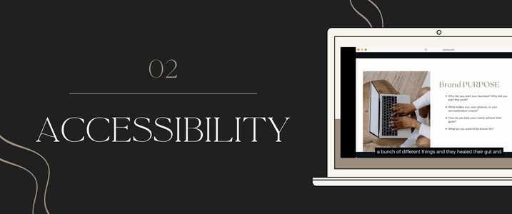
Gone are the days of designing with only allistics in mind. In 2023, we’re making our website accessible to all visitors, including those with disabilities.
Here are some ways you can incorporate accessibility into your website and other business collateral:
- Strong color contrast for the visually impaired
- Functional alt tags for images for the visually impaired
- Captions and/or transcriptions for the hearing impaired
- Make sure your website can be navigated in a logical and intuitive way.
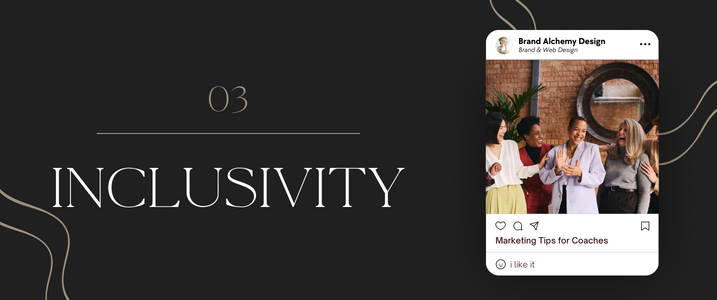
It’s no secret this has been the trend for years but we’re leaning in even more this year by also celebrating unique and diverse human personalities.
You’ll want to represent a diverse range of individuals through personal characteristics, ages, lifestyles, nationalities, genders, religions, and cultures with the use of stock photos, character illustrations and the testimonials you choose to highlight.
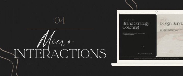
Interactivity and unexpected, subtle animations are another great way to provide value for website visitors and get them to engage with your site. Imagine gradients shifting hues as you scroll and links changing color when moused over.
Here are some ways to include interactivity & micro-Interactions on your site:
- Animated cursors
- Cursor-triggered animations, such as different scrolling behaviors or on-click commands
- Hover animations, like when a link changes color when the user mouses over it
- Quizzes
- Calculators
- Contests
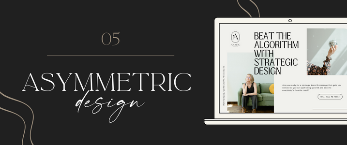
If you’re tired of the rectangular format of traditional websites and want something that’s more visually interesting, you’ll love asymmetrical design. It’s attention grabbing and stops design elements from appearing static and boring.
Experiment with asymmetrical design in these ways:
- Scattered grid style layouts
- Placing symmetrical elements in an asymmetrical layout, or
- Asymmetrical elements in a symmetrical layout
- Breaking up symmetrical layouts with brand marks and other design elements.
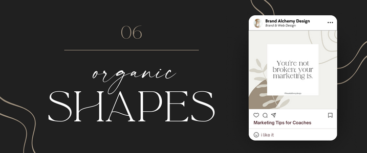
Organic shapes mimic those found in nature, like leaves and rolling hills. They tend to be curvy with loose lines and are less symmetrical in shape.
Organic shapes are perfect for you if you want to express an eccentric, youthful, and upbeat brand identity. Combine it with big, modern fonts to really make a statement.
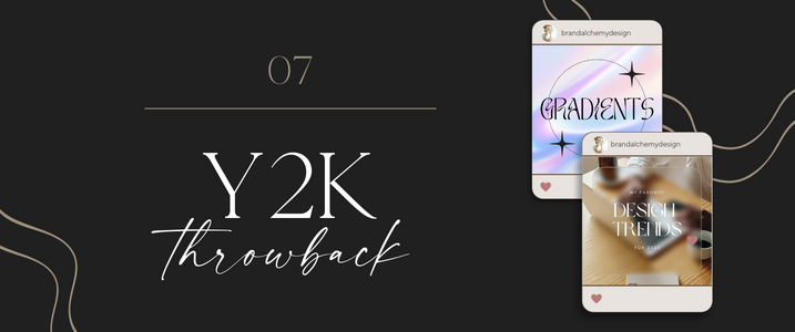
Feeling nostalgic? The early 2000s were characterized by over-the-top futurism that manifested in metallic colors, icy blues, translucent hardware, cyber fashion, and quirky 2D and 3D iconography. Use Y2K design elements if you’re going for a youthful, modern look.
Here are some ways to really nail this Y2K throwback look:
- Using the glass morphism effect – think frosted glass – as a background for text to make it more readable
- Using bright gradients as a background
- Use softer gradient as an overlay
- Holographic-like gradients
- Pair with big, bold typography
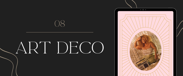
We’re gonna throw it back even further now, all the way back to the roaring 1920’s. Art Deco is all about symmetrical lines and geometric shapes. It’s recognizable by its rich colors, ornate patterns, and ornamental design elements. It’s a great way to add a touch of luxury and elegance to your brand identity.
Because Art Deco can be busy, a little goes a long way. Be careful not to go overboard and end up creating visual stress.
Here’s how to create the look:
- Create dimension with metallic elements, such as gold and silver.
- Choose bold, gilded colors or black & white (think old Hollywood glamor).
- For a more neutral look, use creams, beiges, and soft pinks.
- Create motifs with foliage, flowers, animals, sun rays and the female figure.
- Use geometric shapes and patterns
- Pair with minimalist fonts
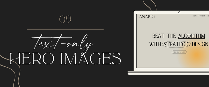
This one has been gaining traction and to be honest, I’m a little surprised. However, from a conversion standpoint, it makes a lot of sense. Less distractions means the copy is getting all the attention, so be sure to have a strong headline in a big, bold font, with a clear call to action.
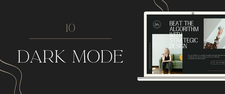
If your vibe isn’t bright and colorful, dark mode will give you an ultra-modern look while also being easy on the eyes. Going dark creates a feeling of status because we associate black with luxury and affluence.
Tips for switching to dark mode:
- Make sure you use high contrast colors that are going to stand out against a black background.
- BUT don’t use pure black because the contrast can be too harsh and end up being harder on the eyes. Use a softer black/gray and a white that’s been muted to avoid this.
- Desaturate your colors so they don’t appear to vibrate against the black background.
- Go for a minimalist design aesthetic because black amplifies visual clutter.
Hopefully you’re feeling inspired for where you can take your brand & web design in 2023. If you want someone to help guide you through that process, book a call and let’s chat! Or if you’re the more DIY type, check out my free workshop, Mastering Your Brand. Sign up below!


Leave a comment